这是程序员表白系列中的100款网站表白之一,旨在让任何人都能使用并创建自己的表白网站给心爱的人看。 此波共有100个表白网站,可以任意修改和使用,很多人会希望向心爱的男孩女孩告白,生性腼腆的人即使那个TA站在眼前都不敢向前表白。说不出口的话就用短视频告诉TA吧~制作一个表白网页告诉TA你的心意,演示如下。
文章目录
一、网页介绍一、网页效果二、代码展示1.HTML代码2.CSS代码 三、精彩专栏一、网页介绍
1 网页简介:基于HTML+CSS+JavaScript 制作七夕情人节表白网页、生日祝福、七夕告白、 求婚、浪漫爱情3D相册、炫酷代码,快来制作一款高端的表白网页送(他/她)浪漫的告白,制作修改简单,可自行更换背景音乐,文字和图片即可使用
2.网页编辑:任意HTML编辑软件(如:Dreamweaver、HBuilder、Vscode 、Sublime 、Webstorm、Text 、Notepad++等任意html编辑软件进行运行及修改编辑等操作)。
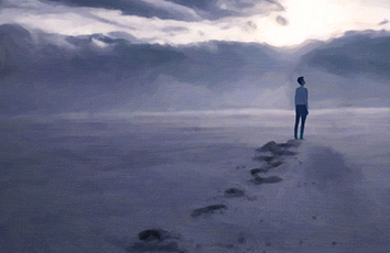
一、网页效果
二、代码展示
1.HTML代码
代码如下(示例):以下仅展示部分代码供参考~
<!--* @Author: your name* @Date: -09-07 10:06:32* @LastEditTime: -09-07 10:29:29* @LastEditors: Please set LastEditors* @Description: In User Settings Edit* @FilePath: \飘动的心(特效)\index.html--><html><head><meta charset="utf-8"><title>飘动的心-3D相册</title><script src="js/jquery.min.js"></script><script src="/css-doodle@0.15.3/css-doodle.min.js"></script><link type="text/css" href="./css/style.css" rel="stylesheet" /><style type="text/css">html,body {width: 100%;height: 100%;margin: 0;background: #270F34;overflow: hidden;display: flex;align-items: center;justify-content: center;contain: content;overflow: clip;}</style><style>/* 飘动的心 */css-doodle {--color: @p(#51eaea, #fffde1, #ff9d76, #FB3569);--rule: ( :doodle {/* 试试修改60 看看效果 你会惊喜发现 */@grid: 60x1 / 18vmin;--deg: @p(-180deg, 180deg);}:container {perspective: 30vmin;}:after, :before {content: '';background: var(--color);@place-cell: @r(100%) @r(100%);@size: @r(6px);@shape: heart;}@place-cell: center;@size: 100%;/* box-shadow: @m2(0 0 50px var(--color)); */background: @m100(radial-gradient(var(--color) 50%, transparent 0) @r(-20%, 120%) @r(-20%, 100%) / 1px 1px no-repeat);will-change: transform, opacity;animation: scale-up 12s linear infinite;animation-delay: calc(-12s / @I * @i);@keyframes scale-up {0%, 95.01%, 100% {transform: translateZ(0) rotate(0);opacity: 0;}10% {opacity: 1;}95% {transform: translateZ(35vmin) rotateZ(@var(--deg));}})}</style></head><body><!-- 飘动的心 --><css-doodle use="var(--rule)"> </css-doodle><!-- 音乐 --><audio autoplay="autopaly"><source src="renxi.mp3" type="audio/mp3" /></audio><!-- 3D相册 --><div id="jsi-cherry-container" class="container"><div class="box"><ul class="minbox"><li></li><li></li><li></li><li></li><li></li><li></li></ul><ol class="maxbox"><li></li><li></li><li></li><li></li><li></li><li></li></ol></div></div></body><script>/* 兼容H5和web端 */var box = document.querySelectorAll('.box')[0];if (navigator.userAgent.match(/(phone|pod|iPhone|iPod|ios|Android|Mobile|BlackBerry|IEMobile|MQQBrowser|JUC|Fennec|wOSBrowser|BrowserNG|WebOS|Symbian|Windows Phone)/i)) {box.style.top = '45%';box.style.left = '42%';} else {box.style.top = '44%';box.style.left = '44%';}</script></html>
2.CSS代码
@charset "utf-8";* {margin: 0;padding: 0;}body {max-width: 100%;min-width: 100%;height: 100%;background-size: cover;background-repeat: no-repeat;background-attachment: fixed;background-size: 100% 100%;position: absolute;margin-left: auto;margin-right: auto;}li {list-style: none;}.box {width: 200px;height: 200px;background-size: cover;background-repeat: no-repeat;background-attachment: fixed;background-size: 100% 100%;position: absolute;/* margin-left: 50%; *//* margin-top: 50%; *//* transform: translate(-50%,-50%); */-webkit-transform-style: preserve-3d;-webkit-transform: rotateX(13deg);-webkit-animation: move 5s linear infinite;}.minbox {width: 100px;height: 100px;position: absolute;left: 50px;top: 30px;-webkit-transform-style: preserve-3d;}.minbox li {width: 100px;height: 100px;position: absolute;left: 0;top: 0;}.minbox li:nth-child(1) {background: url(../img/01.png) no-repeat 0 0;-webkit-transform: translateZ(50px);}.minbox li:nth-child(2) {background: url(../img/02.png) no-repeat 0 0;-webkit-transform: rotateX(180deg) translateZ(50px);}.minbox li:nth-child(3) {background: url(../img/03.png) no-repeat 0 0;-webkit-transform: rotateX(-90deg) translateZ(50px);}.minbox li:nth-child(4) {background: url(../img/04.png) no-repeat 0 0;-webkit-transform: rotateX(90deg) translateZ(50px);}.minbox li:nth-child(5) {background: url(../img/05.png) no-repeat 0 0;-webkit-transform: rotateY(-90deg) translateZ(50px);}.minbox li:nth-child(6) {background: url(../img/06.png) no-repeat 0 0;-webkit-transform: rotateY(90deg) translateZ(50px);}.maxbox li:nth-child(1) {background: url(../img/1.png) no-repeat 0 0;-webkit-transform: translateZ(50px);}.maxbox li:nth-child(2) {background: url(../img/2.png) no-repeat 0 0;-webkit-transform: translateZ(50px);}.maxbox li:nth-child(3) {background: url(../img/3.png) no-repeat 0 0;-webkit-transform: rotateX(-90deg) translateZ(50px);}.maxbox li:nth-child(4) {background: url(../img/4.png) no-repeat 0 0;-webkit-transform: rotateX(90deg) translateZ(50px);}.maxbox li:nth-child(5) {background: url(../img/5.png) no-repeat 0 0;-webkit-transform: rotateY(-90deg) translateZ(50px);}.maxbox li:nth-child(6) {background: url(../img/6.png) no-repeat 0 0;-webkit-transform: rotateY(90deg) translateZ(50px);}.maxbox {width: 800px;height: 400px;position: absolute;left: 0;top: -20px;-webkit-transform-style: preserve-3d;}.maxbox li {width: 200px;height: 200px;background: #fff;border: 1px solid #ccc;position: absolute;left: 0;top: 0;opacity: 0.2;-webkit-transition: all 1s ease;}.maxbox li:nth-child(1) {-webkit-transform: translateZ(100px);}.maxbox li:nth-child(2) {-webkit-transform: rotateX(180deg) translateZ(100px);}.maxbox li:nth-child(3) {-webkit-transform: rotateX(-90deg) translateZ(100px);}.maxbox li:nth-child(4) {-webkit-transform: rotateX(90deg) translateZ(100px);}.maxbox li:nth-child(5) {-webkit-transform: rotateY(-90deg) translateZ(100px);}.maxbox li:nth-child(6) {-webkit-transform: rotateY(90deg) translateZ(100px);}.box:hover ol li:nth-child(1) {-webkit-transform: translateZ(300px);width: 400px;height: 400px;opacity: 0.8;left: -100px;top: -100px;}.box:hover ol li:nth-child(2) {-webkit-transform: rotateX(180deg) translateZ(300px);width: 400px;height: 400px;opacity: 0.8;left: -100px;top: -100px;}.box:hover ol li:nth-child(3) {-webkit-transform: rotateX(-90deg) translateZ(300px);width: 400px;height: 400px;opacity: 0.8;left: -100px;top: -100px;}.box:hover ol li:nth-child(4) {-webkit-transform: rotateX(90deg) translateZ(300px);width: 400px;height: 400px;opacity: 0.8;left: -100px;top: -100px;}.box:hover ol li:nth-child(5) {-webkit-transform: rotateY(-90deg) translateZ(300px);width: 400px;height: 400px;opacity: 0.8;left: -100px;top: -100px;}.box:hover ol li:nth-child(6) {-webkit-transform: rotateY(90deg) translateZ(300px);width: 400px;height: 400px;opacity: 0.8;left: -100px;top: -100px;}@keyframes move {0% {-webkit-transform: rotateX(13deg) rotateY(0deg);}100% {-webkit-transform: rotateX(13deg) rotateY(360deg);}}
三、精彩专栏
看到这里了就 【点赞,关注,收藏】 三连 支持下吧,你的支持是我创作的动力。
情人节程序员用HTML网页表白【飘动的心-3D相册】 HTML5七夕情人节表白网页源码 HTML+CSS+JavaScript